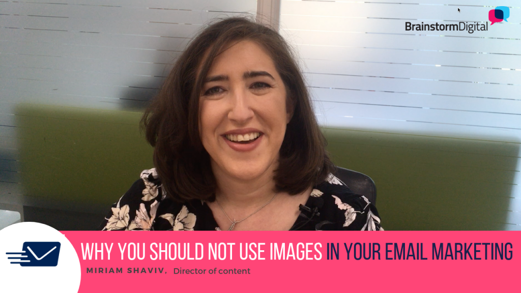
You might think that adding fabulous graphics and images in your email marketing will make people want to open and read them – but that is not the case!
Emails with big graphics scream ‘MARKETING’ and this will quickly turn your readers off.
There is a very simple way to present your emails, that will make your subscribers feel comfortable and build great relationships with them – ultimately leading to more sales for your business.
In my latest Mastering Email Marketing video I will be talking about why it’s a bad idea to use fancy graphics and images in your email marketing.
So, if you want to create the kind of emails that your subscribers will want to open and read… you’re going to love this video. (…And be sure to watch until the very end!)
You’ll learn:
— The reasons why fancy emails with big graphics and images are bad for most businesses
— How to present your emails in a way that will make your readers feel comfortable and build relationships – it’s the same format that the big marketers use
…. And more.
What did you think of this video?
Leave a comment below and let me know if you enjoyed the video. I’d love to hear about what kind of emails have worked best for your business.
Subscribe to our YouTube channel to get notifications when new videos are available.
Share this post with others so that they can get the inside scoop on email marketing. Simply click the social media sharing buttons below to impact some lives now!


