Over the past few weeks, we’ve been working pretty hard here at Brainstorm to promote our new checklist, What’s Holding Back Your Online Marketing?
This mostly involves lots of testing, to see which ads get the page featuring the checklist the most traffic…. and then yet more testing, to see what we need to say on that page to get people to download it.
Through all the tinkering, we’ve managed to lift the Click-Through-Rate of our main ad, on LinkedIn, from 0.024% to 0.080% – ie more than triple it. (A good CTR, according to LinkedIn, is 0.025%.)
The more popular your ad, the more LinkedIn shows it, and more exposure means more clicks – so there’s a snowball effect.
How did we do it?
Here are some of the tests we ran…..
-
Which photo gets more clicks?
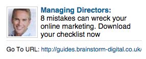
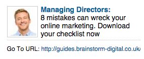
The general rule on LinkedIn ads (which we have also seen) is that images featuring people get lots more clicks than those featuring logos, cartoons or other images. Over the years, we’ve used lots of different headshots, and figured out some rules that work for our audience. For example, we know that pictures of men tend to resonate more (….of course, for your audience, it may be completely different). So which of these two guys got more clicks?
The answer is…..
A, by a very long shot. (0.024% to 0.052%).
It’s a little hard to tell why, particularly because when promoting a different piece of content, B’s headshot outperformed A’s, but here’s my theory. B just looks too happy for an ad aimed at people whose online marketing is not working. Your picture must fit your text.
-
Which audience is more interested in the offer?
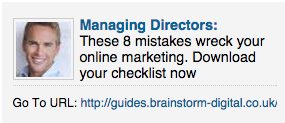
We were aiming our checklist at both business owners and managing directors, but aimed separate adverts at them. They were identical, other than the audience. To our surprise, there was a significant difference in uptake:
Business owners were far more interested in the checklist, with a click-through-rate of 0.080% compared to 0.059%.
You’ll notice that by this stage, we’d also changed two tiny words in the ad, compared to the first experiment: Instead of ‘8 mistakes can wreck your online marketing’, we had ‘These 8 mistakes wreck your online marketing’. By making it far more definite, we increased the number of clicks.
-
Positive or negative?
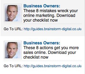
Other than the audience, the most important thing of all to test is the offer itself. We were interested to see whether framing the content of the checklist as a positive or negative resonated better. Here are the two messages we created, each leading to a different landing page that reflected the tone of the ad:
It’s still early days, so I’m not going to declare this one over yet. But so far, which one do you think performs better? Drop me a line at Miriam@brainstorm-digital.co.uk with your guess, and tomorrow, I’ll tell you if you’re right…. I was certainly surprised!


2 Comments. Leave new
Stephen, I will reply to you by email…
Best,
Miriam
I scanned it like a typical male and thought your picture said to me this person may have a good idea, so here I am!
We are in the process of updating the content and design of this site. We are very week on social media. I am looking for a simple solution that works where I can suck it and see then fund it and increase funding based upon success so proportionately it’s a spiralling success. But how?
Regards Steve Webb