Good LinkedIn company pages are few and far between. In fact, bad ones are few and far between as well! Most companies simply don’t seem to bother completing the basic information on them, let alone updating them frequently.
It’s a big mistake. LinkedIn has by far the biggest visitor-to-conversion rate of any of the major social media platforms, and a good company page is a terrific way to showcase everything your company is good at. If you don’t have a company page, your business doesn’t exist on LinkedIn (and it doesn’t matter if every employee has their own profile; these are personal pages, highlighting personal achievements, and not about the company).
Take the pharmaceutical industry in the UK. I set out to write a post highlighting three examples of great company pages – but couldn’t find enough to write it!
There are two possible reasons. One is that pharma is generally behind the curve when it comes to social media. But LinkedIn is the one platform where its executives generally do have a strong presence, so one might have expected them to develop their company pages.
The second is that there is one aspect of company pages that is particularly intimidating to pharma due to industry regulations, and that is the ‘products and services’ tab. But even if you cannot advertise your products directly, there are other ways to use that tab which will not get you into trouble with ABPI – and will do a great amount for your business.
To show you how that can be done, I’m going to look at three examples: one from a British pharmaceutical company that has done a good job developing an all-round company page, one from a Dublin-based pharmaceutical company that uses the careers tab particularly effectively, and one from outside the industry, to show how pharma companies could be using ‘products and services’ creatively – and safely.
I hope that it will give you some inspiration for your own LinkedIn company pages as well as lots of do’s and don’ts of developing the website and tit’s software.
Also a quick advise in case you might need it, it’s to actually make a Software development outsourcing to update the type you are using and of course if you know of a British pharma company page that is particularly outstanding but that we missed, please let us know in the comments.
1. IDEA Pharma
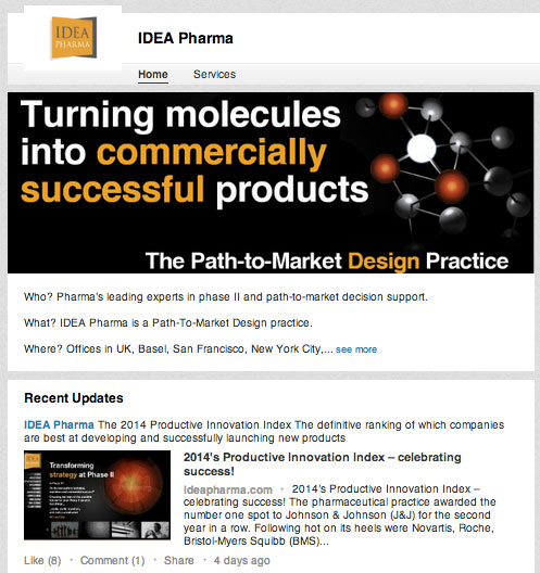
IDEA, which helps pharma products come to market, has really done a great job on every front.
The basics. Their page looks attractive, with a custom-made banner that explains who they are and how they benefit their customers. It follows the colours of the IDEA website, reinforcing its branding.

The description of their company under the banner is clear and professionally written (not always a given!) – this is important because while the company has 22 employees on LinkedIn, their personal profiles will be about them and not about the company.
Status updates.
A great way to make your page worth subscribing to, and then to drive engagement with potential clients you want to cultivate, is to post frequent status updates. IDEA updates their status almost every day.
These posts are good because they’re varied, alternating between links to thoughtful pieces on their own blog (driving traffic to their website – which is where ultimately you want prospective clients to go, isn’t it?), inspirational quotes, questions to provoke discussion, and even some humorous posts.
It’s mostly all pharma-related which is clearly right for their target market, although they talk about themselves a little too often. In general, no more than one post in 6 should be self-referential (potential clients prefer reading about themselves….).
IDEA particularly stands out for its heavy use of visuals, which on every social media platform makes posts more likely to be seen and shared.
ServicesJust filling out this section puts IDEA at a massive advantage, so the bar is rather low! But IDEA has again done a great job, listing 11 services so that visitors can see the full range of their offering (and they are more likely to come up in searches), and even earning several recommendations.One terrific feature is that they have included a short video clip of a staff member (presumably – why are they not identified?) speaking about strategy at phase II – which is their speciality.Videos are an increasingly popular way to reach out to potential clients online, who may prefer to hear and see a company rather than read about them. Study after study has shown that potential clients are more likely to trust a company they have seen and heard in action, and therefore more likely continue down the buying process.The clip would have been even more effective had it been shot specifically to welcome people to the company’s LinkedIn page and provide an introduction to the company – perhaps with a client also speaking in recommendation?
Other possible tweaks: On this page, too, IDEA could have included a banner. In fact, LinkedIn allows you to add three banners on each page, which rotate and are hyperlinked to a page of your choice. It’s a great opportunity to direct traffic and to issue powerful calls-to-action.
Additionally, if each service had its own picture or icon, it would help to define it visually; they could also ask clients for more recommendations, building their credibility.
All in all a fine effort.
2. Icon Plc.
Icon is a global provider of outsourced development services to the pharmaceutical, biotechnology and medical device industries, headquartered in Dublin. It does many of the same things well as IDEA – such as a powerful banner, frequent updates (although again, way too many about them!), and a good range of products, services and recommendations.
![]()
So let’s concentrate on an additional tab it has developed: careers.
This option is not open to everyone – it is an upgrade for which you have to pay, and it doesn’t come cheap, so it is used almost exclusively by large companies.
But if that’s not you, don’t stop reading! We’ll review what Icon does and then suggest how you can learn from them even if you can’t afford the upgrade.
As one might expect, Icon lists over 80 positions it is currently seeking to fill across the world, linking to a detailed job description and button to apply. LinkedIn is a great place to find talent.
But Icon does so much more with the page, using it to demonstrate why it is a great place to work in order to attract the best.
It covers the basics, providing links to information about its culture, values and diversity, but more importantly it allows its employees to speak for themselves. It has posted two quotes from team members explaining why they work at Icon, as well as a 4-minute, professionally produced video interviewing various staff members about why they chose Icon and why they are still there.
This is powerful testimony: Prospective employees are more likely to believe it’s a good place to work if it is their peers saying so, and not just more text on a company website. It also gives prospective workers the chance to see what kind of people work there.
Crucially, Icon has interviewed a good cross-section of people, of both sexes, different roles and based in different countries.
Careers
On the same page, job seekers can also access a list of all Icon employees on LinkedIn (over 7,000), making it easy for job seekers to check their backgrounds and job titles.
The page could have been even more powerful if its video had employees taking LinkedIn visitors through a typical day at work or talking about their jobs in more detail. At the moment, the emphasis is on testifying that Icon is a good place to work. Nothing would demonstrate that more clearly than showing that the work itself is interesting and rewarding!
Can’t afford a careers tab? If you still want to advertise positions, check out LinkedIn Jobs, which then appear on your company page. It’s not free, but it’s reasonable. You can also post jobs on your main company news feed, which doesn’t cost.
Want to make your company look attractive to prospective employees? You can still create videos of your employees and interview them about their jobs. Instead of putting them on the careers tab, post them on your blog and then promote them across social media – as well as on your company page. Profiling employees who do interesting things is always great material!
Make sure, as well, that all your employees are properly linked to your company page so that their names are listed. When they note their current employer on their personal page, they need to pick your company’s name from a list that appears as they begin typing and not just complete it themselves.
3. Hubspot
Hubspot is a wildly successful inbound marketing platform (ie its software helps people promoting their businesses online generate leads). Nothing at all to do with pharma – but there is still something pharma can learn from it.
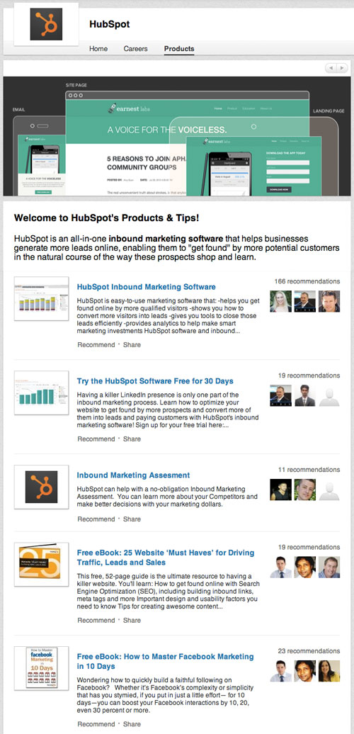
Take a look at its products page. Guess what! It’s not all about its products:

That’s right. In addition to publicising its software, Hubspot uses this space to offer free trials, a free marketing assessment, and – most importantly from pharma’s point of view – free eBooks.
The point is that you have to define ‘products and services’ very broadly. Can’t spotlight your drugs? Create some free guides that will be of interest to potential clients, or to stakeholders, or to another group you want to target and give them away on your products page. List your existing white papers. Drum up interest in your upcoming webinars.
This way, you are using the tab to show off your expertise, become a thought-leader, and build up a closer relationship with people you want to reach.
That’s it! Have you seen any examples of great pharma company pages that we’ve missed – or do you have any ideas of how they can be creatively used? Let us know in the comments!
Miriam Shaviv is director of content at Brainstorm Digital
If you enjoyed this piece, you might like:
- 3 pharmaceutical companies whose blogs rock
- 8 tips for pharma companies struggling with social media strategy
- In a regulated industry? How to minimise risk on social media


